So you’ve got a WordPress website running (nice! 🎉), but here’s the thing most beginners forget: keeping WordPress updated is one of the easiest ways to protect your site.
Seriously. A lot of hacked websites happen simply because the site owner ignored updates.
WordPress developers constantly release security patches, bug fixes, and performance improvements. If you skip those updates, your site can become an easy target for malware or hackers.
Don’t worry though. Checking for updates is super easy. I’ll walk you through it step by step, like a friend helping you tune up your website. 🚀
How to Check for WordPress Security Updates (2026 Guide)
Why WordPress Security Updates Matter
Think of updates like software vaccines for your website. They protect your site from newly discovered vulnerabilities.
Here’s what updates usually include:
🔐 Security patches to protect against hackers
⚡ Performance improvements so your site runs faster
🐛 Bug fixes that solve annoying issues
🧩 Compatibility updates for plugins and themes
And remember, WordPress isn’t just one piece of software. Your site runs on three main components:
1️⃣ WordPress Core
2️⃣ Plugins
3️⃣ Themes
If any of these become outdated, your site could run into security risks or compatibility problems.
That’s why checking updates regularly is important.
Before Updating (Quick Safety Tip)
Before you update anything, always create a full backup of your site.
Even though updates are usually safe, sometimes a plugin or theme may not play nicely with the newest version.
A backup means you can restore your site in minutes if something breaks.
Good backup plugins include:
• UpdraftPlus
• Jetpack Backup
• BlogVault
Trust me, future-you will be thankful. 😅
Step 1: Open the WordPress Updates Page
Let’s check if your site needs updates.
1️⃣ Log in to your WordPress dashboard
2️⃣ Go to Dashboard → Updates
This page shows everything that can be updated on your site.
WordPress usually checks for updates automatically, but you can also click:
“Check Again”
to refresh the list.
Easy.
Step 2: Update WordPress Core
At the top of the page, you’ll see the WordPress Core section.
In most cases you’ll see a message like:
“This site is automatically kept up to date with security and maintenance releases.”
That means minor security updates install automatically, which is great.
However, major WordPress releases still require manual updates.
If a new version is available, you’ll see an Update Now button.
Just click it and WordPress will handle the rest.
Pro tip: Major updates usually come 3–4 times per year, so don’t ignore them.
Step 3: Update Plugins
Scroll down and you’ll see the Plugins section.
Plugins often receive updates for:
• security fixes
• new features
• compatibility with the latest WordPress version
To update them:
1️⃣ Select the plugins you want to update
2️⃣ Click Update Plugins
Or just hit Select All if you want to update everything at once.
Done. ✔️
Step 4: Update Your Themes
Next comes Theme updates.
Themes also get improvements and security patches, so keeping them updated matters.
To update themes:
1️⃣ Select the theme
2️⃣ Click Update Themes
Simple.
⚠️ But here’s something important.
If you edited your theme files directly, updating the theme might overwrite your changes.
The best practice is to use a child theme so updates don’t remove your customizations.
WordPress Automatic Updates in 2026
Modern WordPress versions now allow automatic updates for plugins and themes, not just the core software.
You can enable this from:
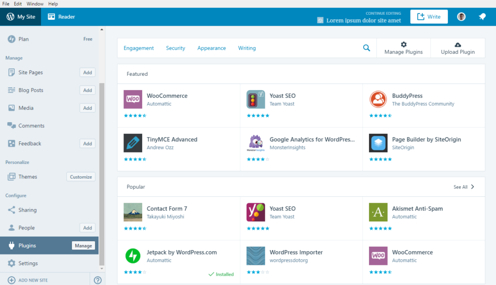
Dashboard → Plugins
Then click Enable Auto-updates next to the plugin.
Same thing works for themes.
This is great if you want your site to stay secure without constantly checking updates.
Just make sure your plugins are from trusted developers.
Signs Your WordPress Site Needs Updates
If you notice any of these, check updates immediately:
⚠️ Plugins stop working properly
⚠️ Your dashboard shows update notifications
⚠️ Site becomes slow or buggy
⚠️ Security warnings from hosting or security plugins
Ignoring updates can eventually break your website.
Bonus Tip: Set a Monthly Update Routine
A simple habit many developers follow:
📅 Check updates once a week or once a month
The routine looks like this:
1️⃣ Backup the website
2️⃣ Update plugins
3️⃣ Update themes
4️⃣ Update WordPress core
5️⃣ Quickly test the website
Takes about 5 minutes and keeps your site healthy.
Final Thoughts
Keeping your WordPress website updated is honestly one of the easiest security wins you can get.
A quick update check can protect your site from:
🛡️ malware
🛡️ hackers
🛡️ compatibility issues
Just remember the golden rule:
Backup first. Update second. Relax third. 😎


